Cromi is an iPhone app that makes public transport in my home city of Santiago de Chile easier and much nicer to navigate. It delivers arrival estimates for public buses in a map that’s complete with fare card reloading spots and subway stations, visualization of transit lines with real time bus positions, and the ability to keep track of the balance of any amount of fare cards, all in a beautifully fluid and minimal user interface.
Beginnings
Cromi started because, in December of 2016, I discovered a publicly accessible API that delivered estimated arrival times for buses throughout the city and was run by the official operator of digital services in Santiago’s transit system. This meant that anyone could be free to write apps that deliver this information to people without worrying about the data source. I was excited.
Like many great things, it all started with a quick and dirty prototype, which was a native iOS app that could only do one thing: show stops on a map. This was so easy to accomplish that I wanted more. Jumping into Sketch was the next logical step.
The first mocks for Cromi (below) were made with real data obtained through the API, which besides stops, also included subway stations and places to reload fare cards. The designs revolved around the simple idea of using map callouts as the key information delivery mechanism.
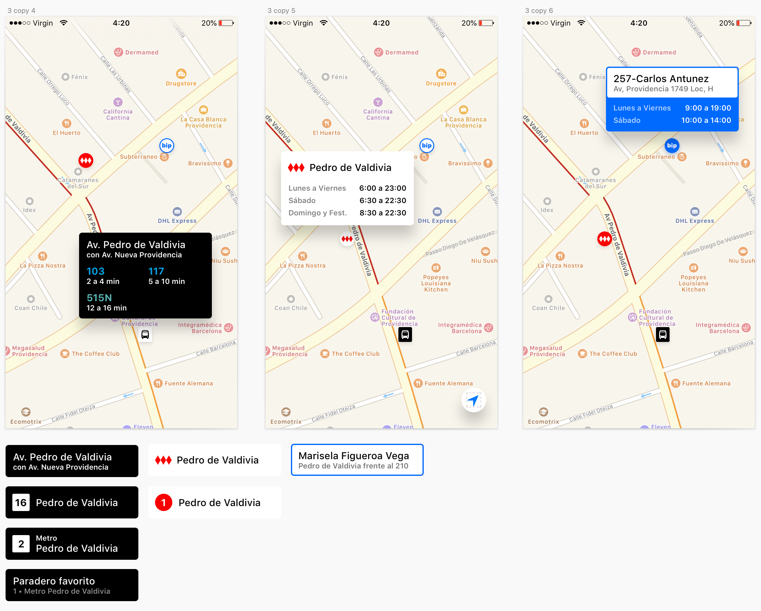
I envisioned a system of ‘signs’ that consisted of a header and a content area that represented the relevant unit of information for each sign type—for stops it was services, for everything else, it was hours of operation. Crucially, the signs needed to display as much information as possible while still allowing for meaningful map interaction, even on the still-relevant 4-inch display.
To increase maintainability, I wanted the same header component to be reusable across all sign types, so its layout needed to scale while allowing for easy visual differentiation. I approached its visual design the way I would approach the API design for a code component: by evaluating its use cases, establishing key generic properties, and identifying edge cases.
After these explorations, I jumped back into Xcode to build out code components. While trying out the signs, it became clear that coupling them with a freely scrollable map made it very easy to push the signs offscreen. To address this, I made them stick to the edges of the screen even if their originating pin isn’t visible. After getting a rough version going, other things happened in my life and the project went on hold.
Project Principles
These principles appeared organically—this is a retrospective rendition.
- Ruthless simplicity. I couldn’t give this project too many resources, so I needed to focus on the bare essentials.
- Ship early, ship often. Don’t have long release cycles with major additions—add things incrementally, reduce dependencies, release as soon as a feature is ready or a bug is patched.
- Prioritize by usefulness and engineering lift. If new things are to be added, they need to be the most useful and impactful while also having the lowest cost in terms of development.
A key thing to note here is that, by ‘resources’, I mean my own time. Nobody else works on this app, and my main priority in terms of hobby projects is Doppi, so I really had to restrict how much work could go into this.
VMVP: Very Minimum Viable Product
0.1: The Real VMVP
By March of 2017, I was back living in Chile after having spent some time in the San Francisco bay area. After shelving the project and explorations for a while, the app one day became a necessity, and I wasn’t even carrying a build.
I was worried that the basic skeleton that I had built out wasn’t enough, but my future users (also my friends, but trust me, they’re ruthless) confirmed that they would find this core functionality useful, even if somewhat basic. My main concern was whether having the map as the only navigation interface, as the only way to find information, was going to work for people.
In reality, being near or at the stops made it pretty easy to find the right one and get the information super quickly. To improve upon this simplicity and make it even more efficient (almost… magical?), I eventually made it so that the nearest stop opens automatically after the app loads, eliminating the need to interact at all to get useful information immediately—if you were at the stop, of course.
Even though the API had both time and distance data for the next two buses per service, I wanted to be ruthless about simplicity, so Cromi 0.1 only displayed the time estimate for the nearest bus. And that was it, there was nothing more to it. I put the app on the App Store in April 2017, and besides a few quick patch releases, I forgot about it for a good part of the year.
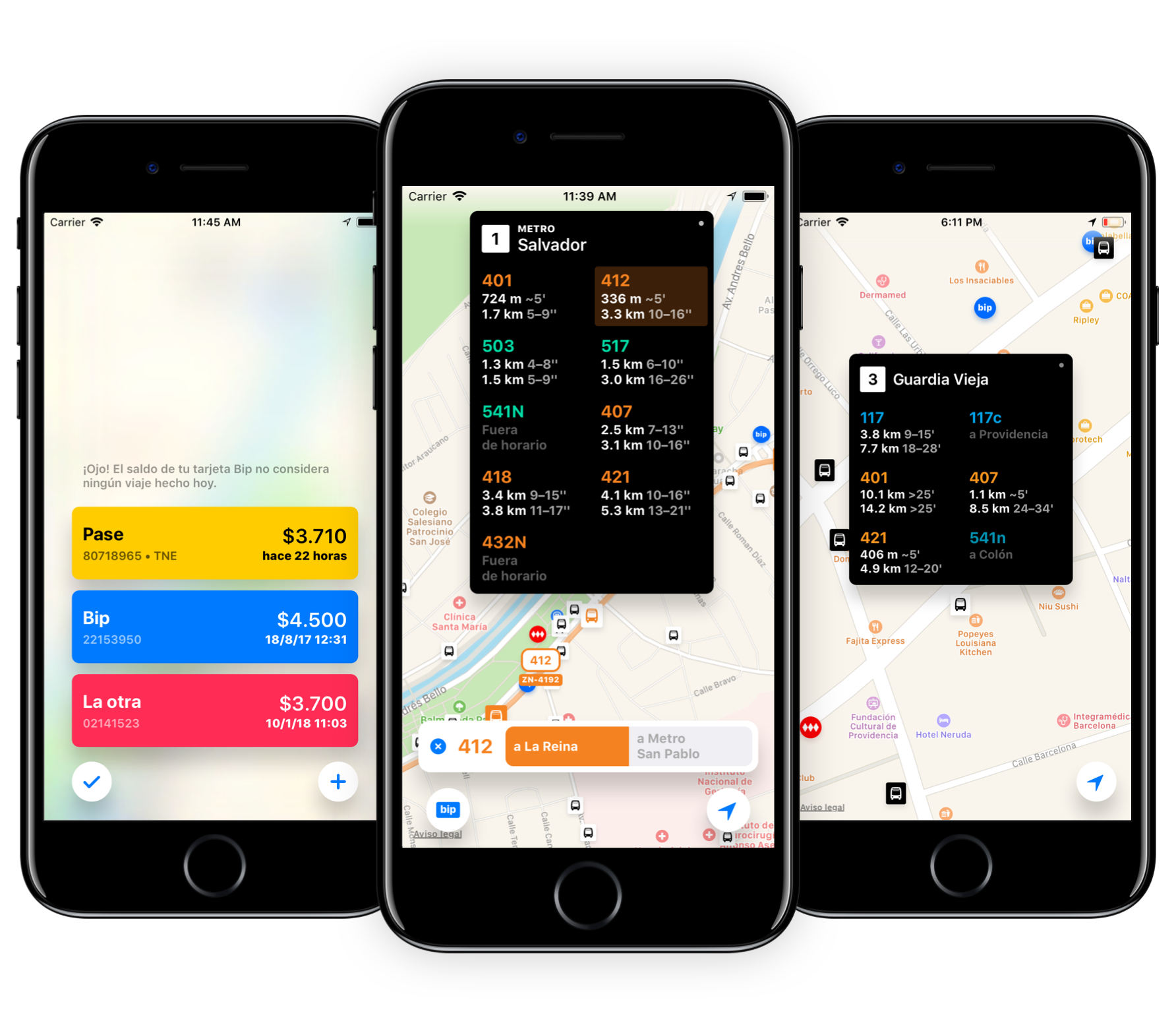
0.2: Data Display Improvements
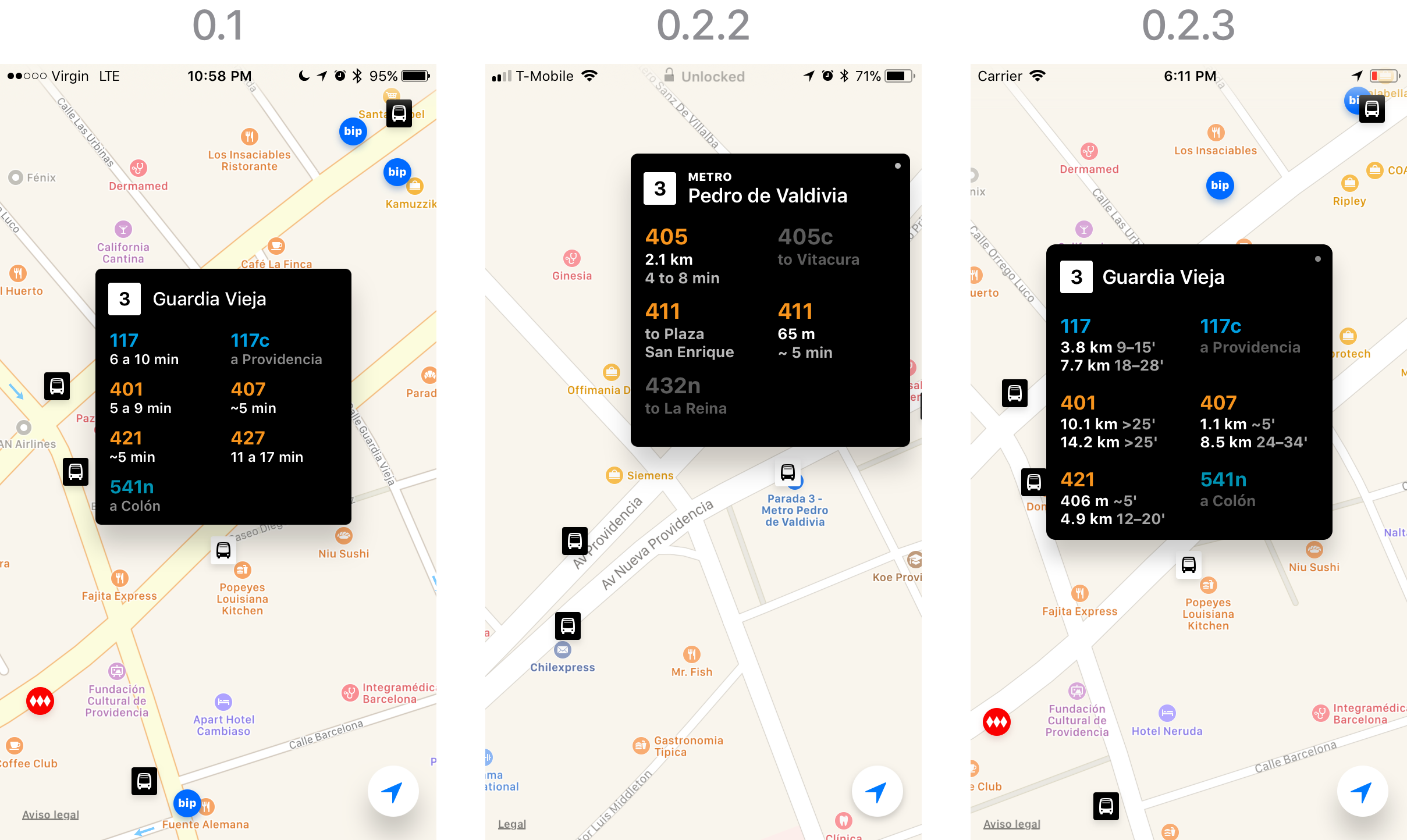
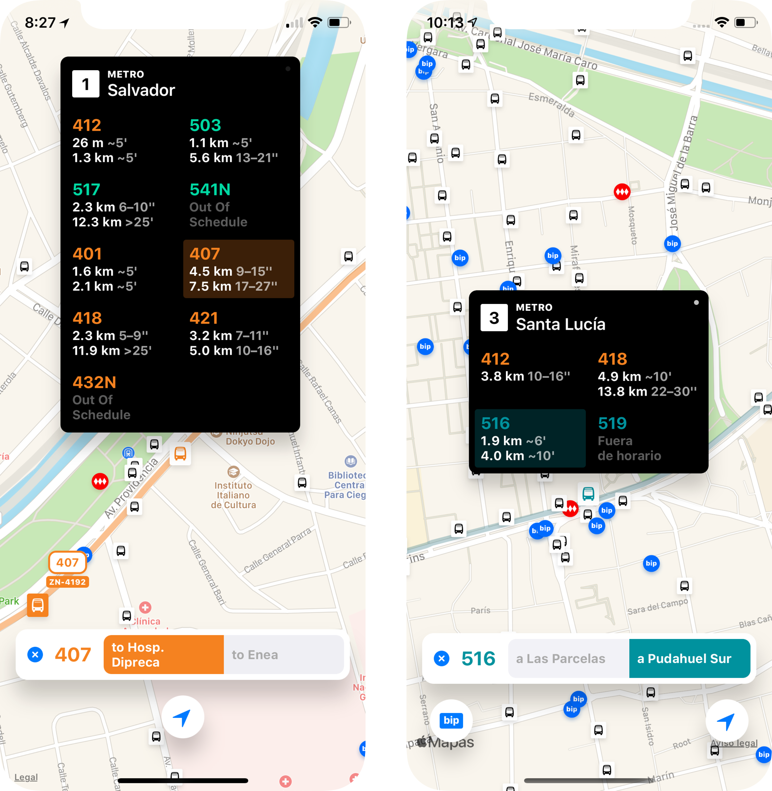
I picked it up again in October, and through the end of November, pushed out versions 0.2 through 0.2.4. In the UI front, I improved stop signs by adding distance data—which I made the primary prediction information, since it was the most precise—, and on 0.2.4, I added a second bus estimate to each service.
Each service cell could now display 4x the amount of information compared to the original, but I wanted to be really conservative about the size of signs so that the app remained usable in 4-inch phones, the most popular iPhones in Chile at the time. I also didn’t want to run into too many design and technical hurdles on stops with a lot of services. I methodically optimized every point on the screen for density and legibility, and while the resulting signs are wider and taller than on 0.1, they are still compact enough to work.
Through user feedback, I realized that people weren’t sure about whether the information on the stop signs was updating. Someone even wanted a manual refresh button! The information updates automatically, so I added a ‘continuous refresh indicator’: a small white circle in the top right corner of the stop sign that fades in and out in a loop.
While making seamless experiences that ‘just work’ is important, it’s easy to get lost in the idealization of functional simplicity. Communicating through seemingly decorative details like this one can convey the nuanced idea of automatic data updating with relative clarity while providing a sense of subtle reassurance, which improves the overall perception of the experience.
Major Studio Cycle
In August 2017, I joined the Design and Technology MFA program at The New School Parsons. The final Major Studio 1 project had to be something of our own, and we had one month to conceptualize, develop, and document it. Anthony Deen, my professor at the time, graciously allowed me to work on Cromi, which was recent enough and early enough in its development to have growth opportunity within that timeframe.
The vision for Cromi established on the final paper involves an app that can assist throughout the entire process of using public transit, which, as I defined it, has 3 stages: plan, wait, and ride. This meant that the product envisioned there is far beyond the scope of the product today, which focuses mostly on the ‘wait’ stage. On this case study, I’ve decided to focus more on the reality of the product rather than on this holistic but hardly reachable vision.
This development cycle encouraged me to think deeply about the identity and intention of the product, helped me delimit clear design goals, and pushed me to iterate quickly based on user research. Within the timeframe, I was able to release two major features and started work on a third, which shipped a month later. Other features were designed and an entire roadmap towards the end-to-end vision was planned.
Design Goals
Some of these pertain to the larger vision for the product, but most are reflected in the shipping product today.
- Modular, not modal. Instead of designing flows that lock you inside them, build components that can harmonically coexist and be composed together. Build isolated features that compose into an ‘assisted’ flow for low-confidence trips, but that can also be accessed independently when needed on higher-confidence ones. For example, a notification that tells you to hop off on the next stop could be used as a part of a step-by-step navigation flow, or requested independently.
- Make all key data always accessible. Don’t make people learn when they can access some information and when they can’t. As a map-based app, this means not locking people into ‘map modes’ that conditionally restrict access to information—if new information needs to be presented and prioritized, deemphasize the rest, but keep it available if requested. Concretely: always show all stops on the map and keep them interactive, regardless of any other information layers that might be visible; always allow access to fare card information.
- Minimal, yet intuitive. Reduce the amount of UI and its footprint to the lowest possible to provide clarity about the available data and functionality. Make it so that the intuitive way to do something is the right way to do it. How do you query a stop? Just tap it. How do you see a service’s route on the map? Just tap it. How do I see live buses? They’re already there when viewing a route, so they have to be clearly visible.
0.4 & 0.5: Service Routes and Live Bus Tracking
The first phase of Cromi’s evolution was adding a way to visualize the routes for each service. Figuring out the entrypoint was easy enough: tapping a service on the stop sign would do. My intuition was that people might want to access service routes without having to visually find a stop first, but as soon as the idea of building a search feature came to mind, I shunned it away, because it was a tangential need that would distract me from delivering the actual feature.
Bus services in Santiago have different colors depending on the company that operates them. This seemed like a great opportunity to add a pleasant visual shift when viewing routes that helped reinforce the state of the app and the currently selected service.
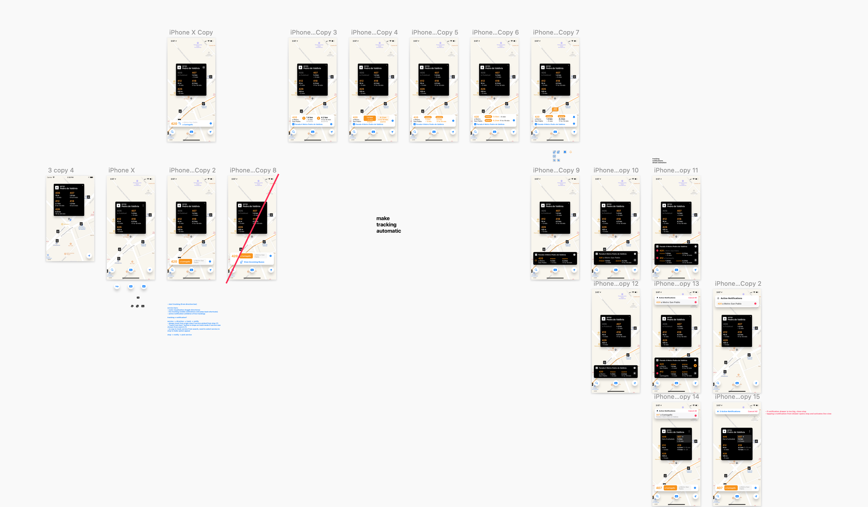
When I started designing Service Routes, I was also thinking of two future features: live bus tracking (seeing a bus live on a map) and incoming bus notifications. I tied all three in a sequence: open a route, see an affordance to track incoming buses, select it, see a new affordance to subscribe to notifications. (This was before I came to my principle on modular features.)
In this world, live bus tracking was a mode that was about delivering all possible information relative to incoming buses for a service at a stop. The mode was denoted by a bar that had to include the stop to which the tracking was relative to, plus regular bus arrival estimations, and an affordance for notifications. Even though other data on the map was still accessible, you had this persistent and crufty piece of UI reminding you that, hey, you’re in this mode.
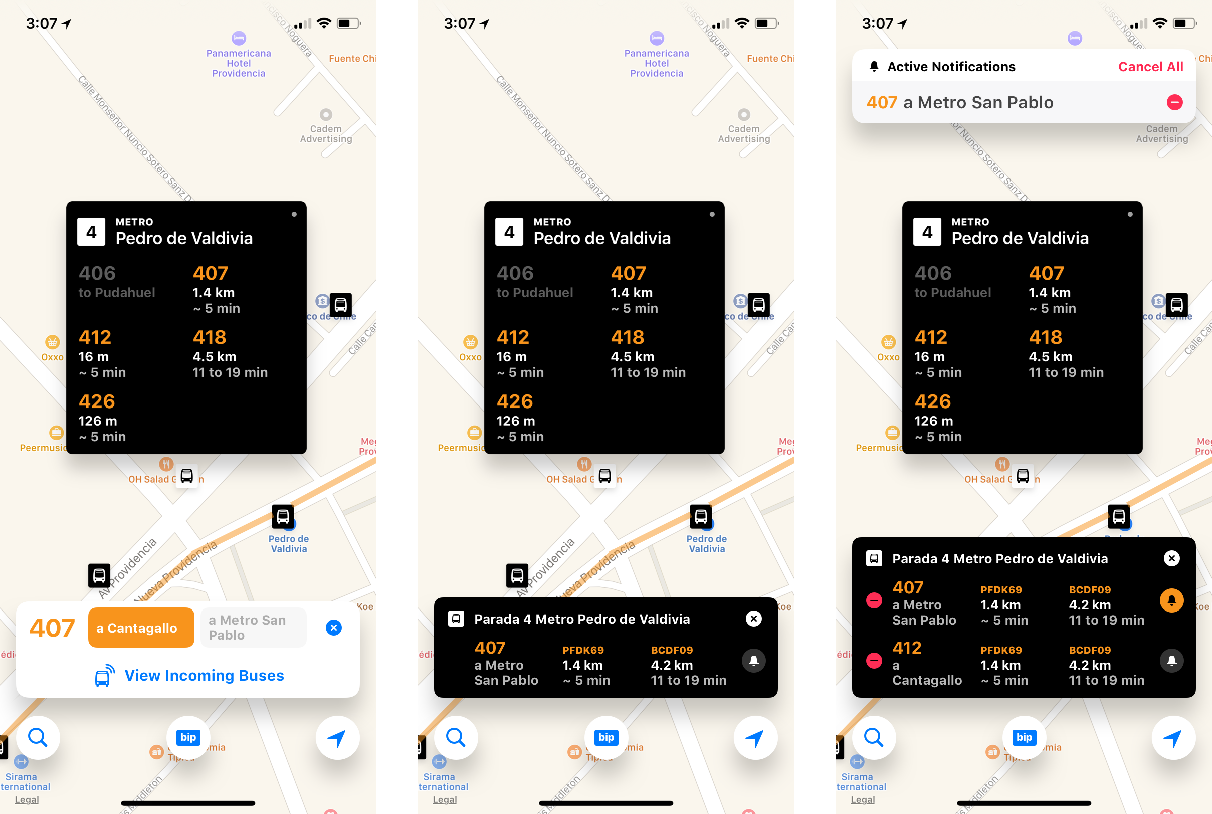 A failed flow for live bus tracking and notifications. I cherry-picked the most decent-looking screens, believe it or not.
It was a mess. These very failed explorations that took complexity to an extreme were some of the driving factors behind my principles on modularity and minimalism. After realizing what I had done, I made some decisions:
- Make live bus tracking seamless. Instead of having the user take action to see live buses on the map, just display them along with the route.
- Build a different entrypoint for notifications. This is a feature that’s important enough to not be hidden behind all this sequencing. It should also be easy to choose multiple services to be notified about, which, in terms of interaction, was similar to the vision for ‘saved’ stops—it made sense to group it with that UI.
One last hurdle that these features had to overcome was visual hierarchy on the map. The initial designs called for all stops to remain the same while viewing a route, but trying this on the actual app made it immediately obvious that it wouldn’t work. Also, the initial representations of a bus on a map weren’t very easy to spot.
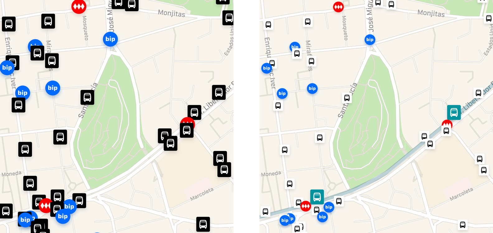 Hierarchization of routes and their stops on the map.
After much iteration in code, the first issue was solved by inverting the white-on-black color scheme for stop pins that weren’t part of the route and reducing their visual scale, while colorizing the background of the in-route stops with the color of the service. The second was also resolved through contrast enhancements.
0.6: Fare Cards
The fare cards feature was designed during the Major Studio Cycle, and was a fast follow in terms of release scheduling. This was the first explicitly delimited mode on the app, which I wanted to make exceedingly clear by blurring everything behind it.
I designed and built a generic container for modal interactions that handled the background blur, supported a standard button row at the bottom, and provided a generic content area. The component automatically aligned the content to the bottom of the screen for reachability, allowed contents to scroll if they were tall enough, and provided a built-in dismissal gesture that was triggered by pulling the content down. The gesture’s effect was reinforced by a dynamic change in the radius of the background blur, and the dismissal trigger point was denoted by haptics and by the ‘dismiss’ button becoming very visibly highlighted.
I know a lot of people have more than one fare card, so I wanted to enable keeping track of as many cards as they wanted. Each card is differentiated by assigning them a name and color, to make them as glanceable as possible. The balance data has at least 24 hours of delay, so it was important to highlight the time of last update as well.
The dialog for adding a new card was designed in the same bold visual language of the fare cards. It was fully designed in code—there are no mockups for it. The flow needed to be slightly sequential, because a card number needed to be validated before it was added. The ‘Add’ button was disabled until the app determines the number is valid, otherwise, it shows an alert.
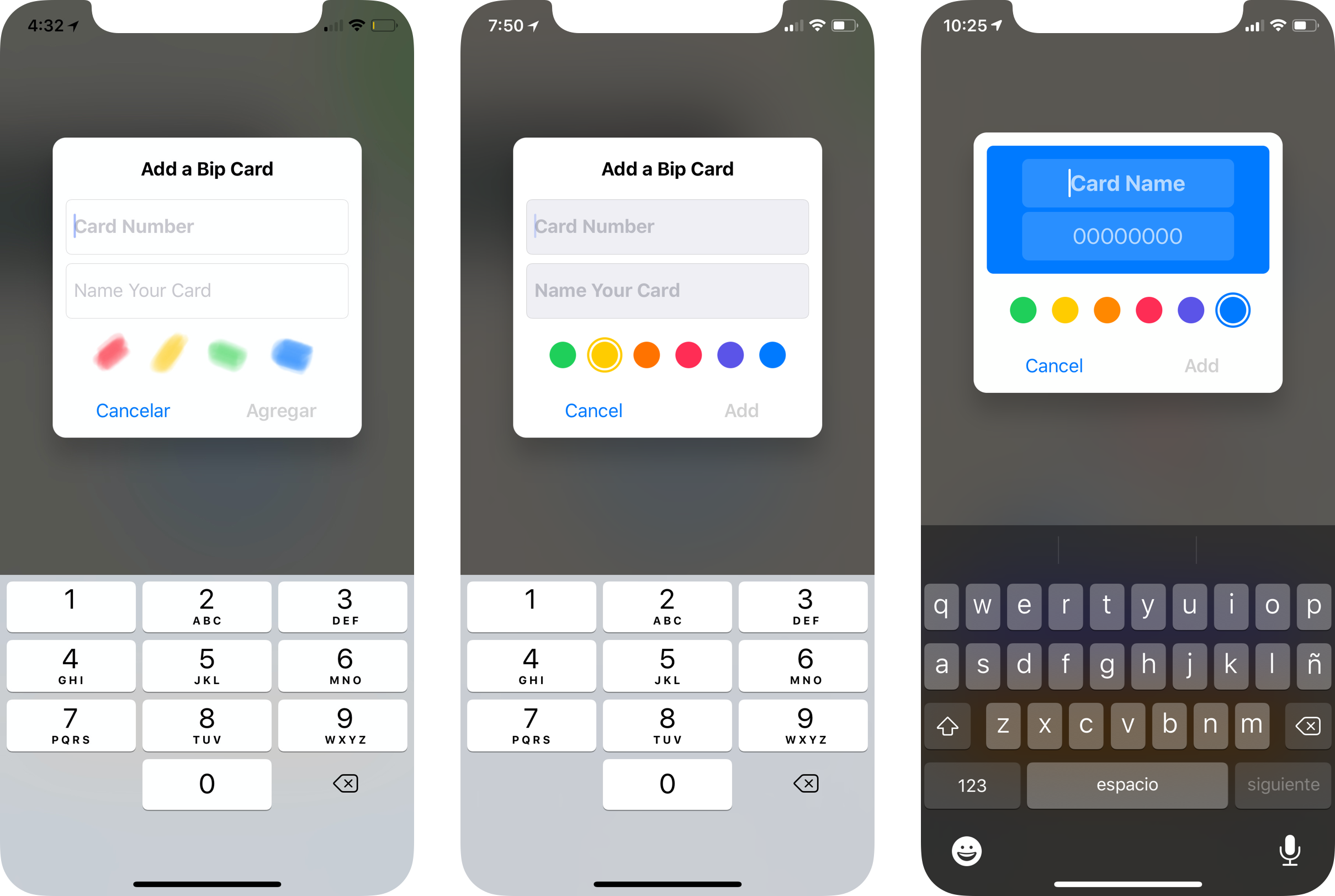 Progression of the Add a Bip Card dialog.
I first tried putting the card number field first, but observed that testers either ignored the name field and just added cards as soon as the ‘Add’ button became enabled, or often got interrupted midway through typing a name by an ‘invalid card’ alert, which meant going back to the first field to edit. Another consideration is that, while the regular iOS keyboard can use the return key as a ‘next’ key to change fields, the numeric keypad doesn’t even have a return key, so moving to the next field requires tapping on it, which takes more effort.
So I flipped these fields, enabling people to write a name before anything else and without interruption, and to pick a color for their entered card while the app is validating its number. This dialog flies in from the top right when invoked, ‘falls’ to the bottom of the screen when canceling (as if ‘throwing away’ the ‘draft’ card), or flies back to the top if successful.
Overall, thanks to the careful consideration of everything from information architecture, to typography, colors, and animations, the interaction for this chore—numeric data entry—ends up being fluid, seamless, and even joyful.
Designed Features
Some of the features that were fleshed out during the Major Studio Cycle never reached the product.
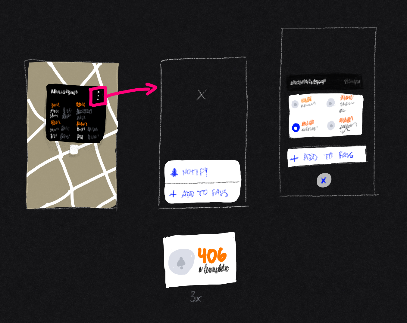 Initial sketch for favorite stops, paired with notifications.
Bus Arrival Notifications
This feature allows people to receive push notifications when the buses they intend to ride are arriving at their stop, instead of them having to stare at the app or having to constantly check back.
Because, in many cases, more than one service is useful to reach a destination from a given stop, I thought it was important to give people an easy way to select multiple services to be notified about. And because these notifications are intrinsically related to a stop, it made sense for their entrypoint to be from the stop sign.
After subscribing to notifications, the app is constantly polling the data in order to trigger them. It should be easy to tell that these invisible actions are running without over-cluttering the screen, and it should be easy to tell the app to cancel them all, or any one in particular.
My solve for this was an ‘Active Notifications’ bar that lives at the top of the screen. Cromi prioritizes placing interactive elements at the bottom of the screen for reachability, but because this element is mostly informative and its key interactions are destructive, I wanted to protect them from unintended taps.
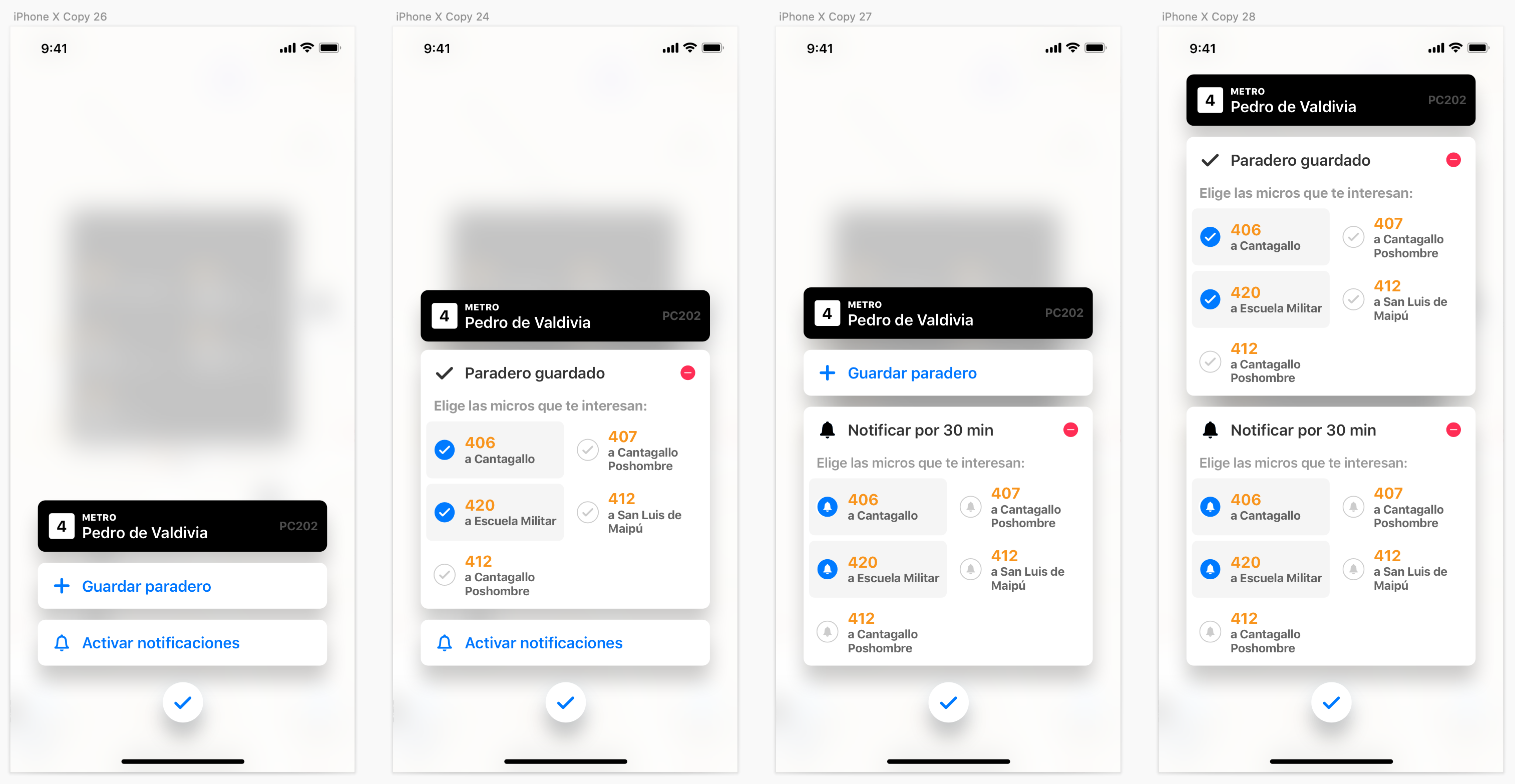
Saved Stops
This feature enables people to save their most frequent stops, and to specify which services they care about on that stop.
Saved Stops could make it easier to surface arrival estimations in a dashboard-esque surface, which could be a more convenient way of checking the upcoming buses in a frequently-used stop that might be harder to find by browsing the map. It could also help people cut through the noise of stops with a lot of services—one of my frequent test cases has 15, and there are some with many more.
Because the UI to save a stop involves selecting multiple services from that stop, like Bus Arrival Notifications, both features are surfaced through an overflow menu on the header of the stop sign, which brings up a modal that allows people to engage with both of them.
Tapping ‘Save Stop’ or ‘Enable Notifications’ within the modal expands their containers inline to reveal a grid that enables multiple selection of stops. The originating button becomes the title portion of the container, which provides feedback about the action being taken and offers an affordance to quickly undo.

Planned Features
The following features got enough time to be conceptualized, but not enough to even be designed:
- Subway Data. Provides visualizations of subway lines and service updates that might assist the user in their election of an optimal routing option.
- Search Surface. Enable people to search for places, stops, and bus services and show them on the map. Provide a surface that aggregates recents, favorites, and eventually, suggestions.
- Places. Enable people to store arbitrary locations as favorites and assign them names. Places could be associated with frequently used stops and services, enabling contextual suggestions or proactive activation of features such as bus arrival notifications.
- Destination Stop Notifications. Enable people to get a notification when the bus they are currently riding is approaching their destination stop.
- Route Calculation. Enable people to search for the best routing options between two points, and to visualize and choose the option they deem optimal.
- Step-by-step Navigation. Provides assistive interfaces that guide people throughout the entire process of traveling to their destination, from planning, through waiting, and riding, plus enabling another wait-ride cycle in case of transfers, and walking directions.
These are roughly ranked by ambitiousness and required effort. Most of them are very involved and require new data sources along with a substantial amount of design and engineering to build them out.
Even though it hasn’t been updated since August 2018, Cromi is still being downloaded about 200 times each week, and is beloved by the people who use it. This is evidenced by a wave of 1-star reviews that appeared on the Chilean App Store in December of 2019 when the SCLTransit API had an outage, which all essentially say: “I loved this app but now it’s not working!!!”
Aren’t people great?