Beginnings
I started Doppi in April 2015 as a response to the release of iOS 8.3, which brought a new Music app that focused on Apple Music and relegated local, synced music to a single tab. I set out to build a better experience for offline music, taking inspiration from the conceptual simplicity of the iPod while integrating and extending contemporary Apple interface paradigms.
Original Principles
- Build a music player that I want to use. Drive design and development mainly by personal instincts and needs. This is my hobby project, after all.
- Focus only on the essentials. Remove or punt whatʼs unnecessary (to me), build more only if thereʼs enough demand.
- Ship a bare-bones app that embodies the core identity of the product. Iterate, polish, and grow later.
- Highlight the identity of the music by making artwork large, prominent, and immersive whenever possible.
- Reduce the footprint of the interface as much as possible, while retaining maximum intuitiveness.
Doppi 1.0: Foundations
Visuals
Doppi started life with a very basic approach to visual design. It leveraged the standard language of iOS 8 and extended it slightly whenever needed. This made it easier for me to ship an MVP while focusing on the core aspects of the app, and helped the product seem immediately familiar to iPhone users.
A receding UI allowed the artwork to truly shine. As it was recommended at the time, the key carrier of the appʼs identity was its tint color. Doppi 1.0 established itself by using its characteristic Doppi Purple on interactive elements (and index indicators, for some reason).
Navigation
The root of the app consisted of 4 tabs: Artist, Albums, Songs, and More (•••). Tabs could be switched by swiping horizontally, taking a cue from the fundamentally gestural navigation of the iPod.
A traditional tab bar clashed with my desire to reduce the interfaceʼs footprint and with the Miniplayer at the bottom of the screen. I landed on an element that fit in the middle of the navigation bar that simultaneously acted as a tab indicator, selector, and as the title of the screen.
The Now Playing screen was omnipresent and could be swiped up from the bottom, essentially establishing a secondary layer above the library, which was reinforced by the coarse use of shadows.
Doppi 2: Exploration
Doppi adopts semantic versioning, meaning only major functionality changes increment the major version. But between 2.0 and 2.4, most core design primitives were re-explored and redefined in some way, and new ideas became core to the conception of the product.
A key thing to remember is that, since I both build and design Doppi, iteration was mostly done in code, and prototyping was always done on a real build of the app. This enables me to quickly test ideas and make decisions based on actually living on them, instead of just looking at static mocks or trying out simulations of the UI.
Added Principles
- Make easy to start playback from anywhere. Remove the need for navigation when playing an artist, album, or playlist by adding Play buttons to all cells.
- Make navigating to related objects easy. Add an entrypoint to the artist from an album, artist and album buttons on the player, context menus for artist/album navigation on songs, etcetera.
- Enable fast interaction through gestures. Wherever it makes sense, provide low-effort, high-reward gestures to navigate across key structures of the app.
- Make Search accessible from anywhere in the library. Have a persistent entrypoint at the root level, create a gesture to invoke it from anywhere, design it so that it can live above any context.
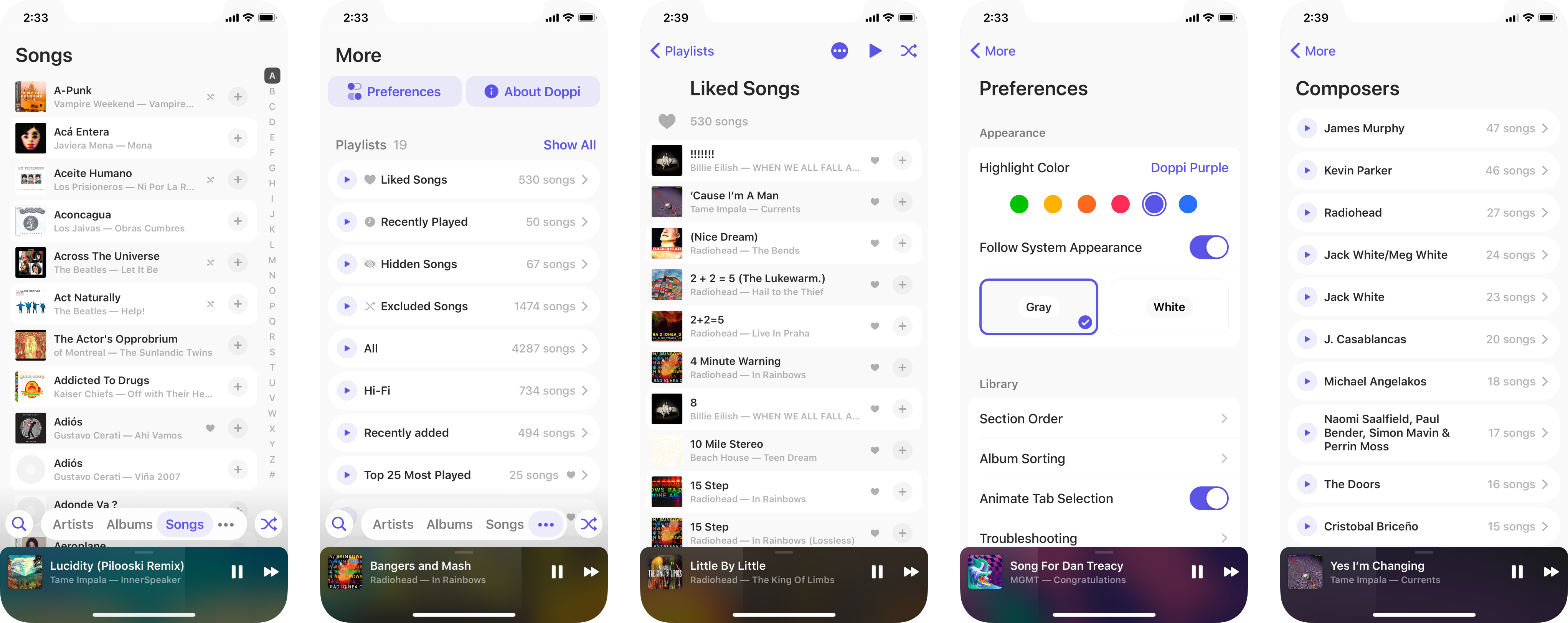
- Make the appearance customizable. Music is a reflection of a personʼs identity. Just like the iPod, let people choose between colors, and between light/dark themes.
Doppi 2.1: Appearance Customization
In addition to offering 6 color options and a dark mode (in 2016), Doppi 2.1 refined its iconography and extended its reach into the concept of interface elevation.
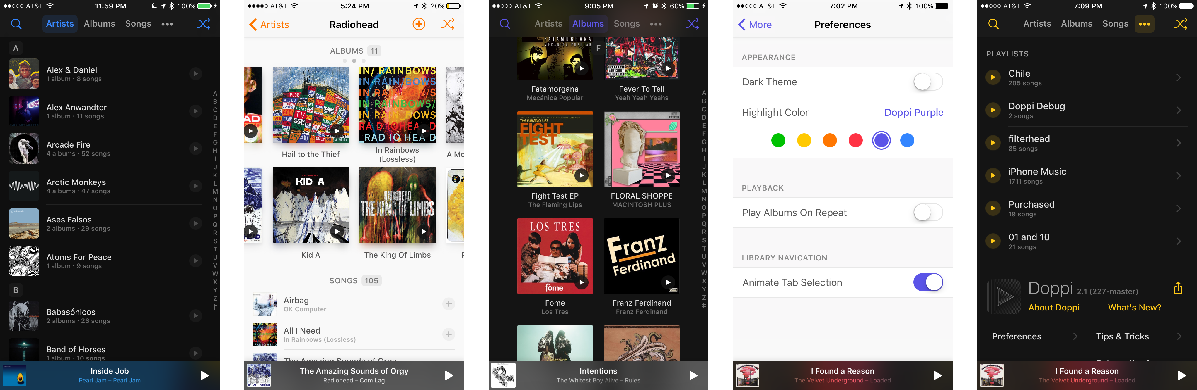
Navigation bars and index indicators cast shadows that established hierarchy (and that reacted to device motion). On dark mode, frontmost elements acquired a lighter background. And on artist detail screens, artwork gained a (then-exaggerated) ‘color glow’ effect that expands the identity of the art beyond its boundaries.
Now Playing Redesign (2.2-2.4)
Many factors went into redesigning Now Playing. Planned product changes, such as Likes and a potential iPad version, highlighted the need to make the design and infrastructure more modular. Trends in music app design led me to explore scaling effects on the artwork on playing and paused states. And I wanted to turn Up Next into a draggable drawer.
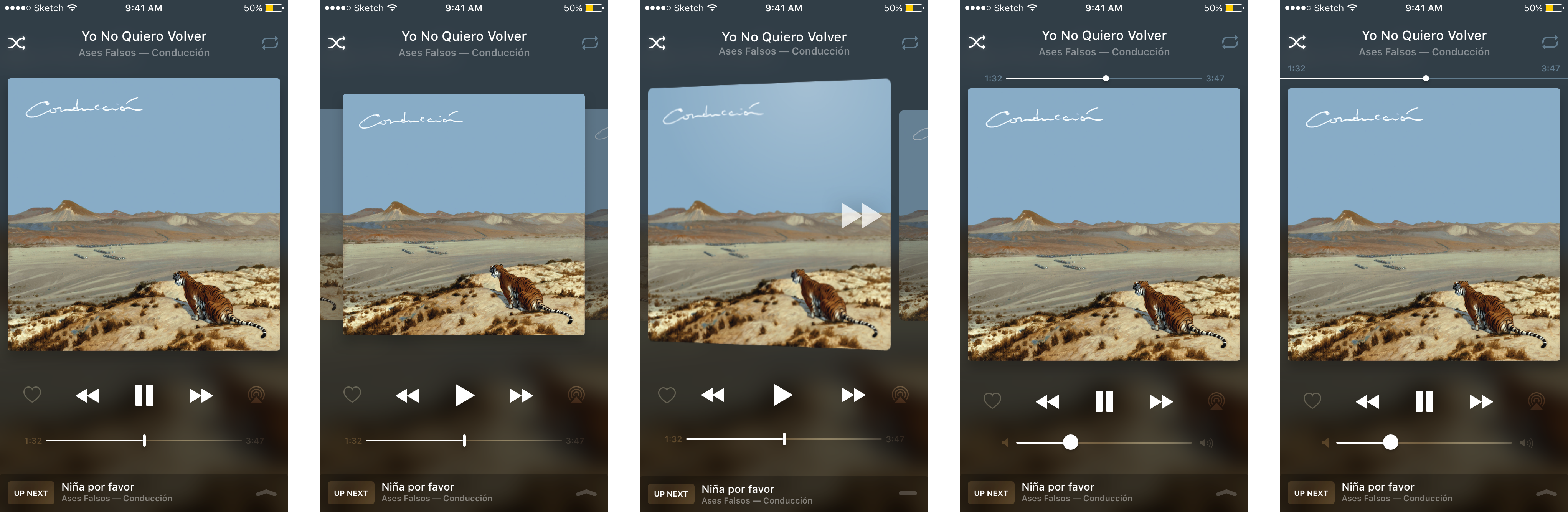 The first mockups for a redesigned Now Playing focused on the position of the scrubber bar and imagined the artwork as a 3D object.
I sent the above mocks to a select group of beta testers for feedback. My personal favorite, the first option, completely removed the volume slider and replaced it with the scrubber bar. I was trying to decouple the bar from the header area and make it more reachable, and assumed people could just use the hardware volume buttons. After living on a build of the app that implemented this change, I proved myself wrong. None of these variants ended up shipping.
So I started wondering: what does a scrubber bar do and how can I make it a more natural part of the interface? The bar a) communicates progress of the song, and b) allows people to skip around the track. But coupled with the volume bar, they become too prominent, and end up visually framing the layout of the controls in a harsh way (see right).
I landed on an element that essentially acted as a lightweight progress bar that framed the current songʼs information. The bar could then be tapped and held to reveal a timestamp above the finger and to freely scrub through the song.
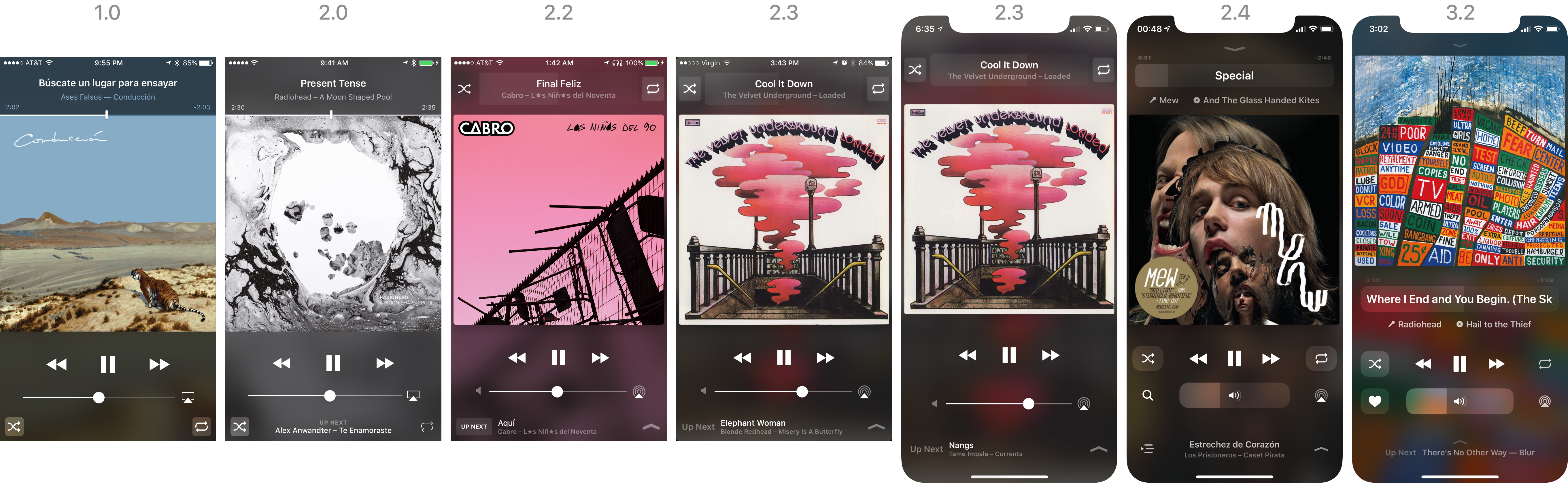
This new layout worked fine on 4.7-inch displays, but it broke down a little when stretched out to the then-new iPhone X. I had also gotten feedback from people who missed having permanently visible timestamps.
To keep with my principle on navigation, I wanted to expose buttons to visit the artist and album screens. The songʼs name needed to be more prominent, and the volume slider in post-iOS 11 Control Center seemed like a clear winner to replace the clunky-looking standard volume slider. (Plus, I could reuse the component I built for the scrubber.)
All of this went into 2.4. But some things were still awkward: the Up Next drawer could only be dragged up from the specific Up Next ‘area’ that was now denoted by an icon that looks like a button but isnʼt a button but sort of acts like a button? There was a Search button as a stand-in for the future Like button because before I could implement Likes, I needed some form of contextual menus, and that was planned, but not yet ready. (Thanks, iOS 13!) Oh, and you needed to use a second hand to access anything in the top part of the screen, but thatʼs probably fine, right? Right?
Search
From the beginning, Doppi had the same two buttons on its root navigation bar: Search and Shuffle All. These were the only two features that seemed worthy, and they still are to me. Shuffle All is still the main way I interact with Doppi. I completely over-compensated for its absence on the iOS 8.3 Music app by giving it prime real estate on my app, and honestly, I have no regrets.
But Search, for such a prominent feature, got the short end of the stick. The search button was the farthest out if youʼre right-handed (and I am). I really wanted an easier way to trigger it, so I borrowed the ‘pull down to search’ gesture from SpringBoard (the iOS home screen).
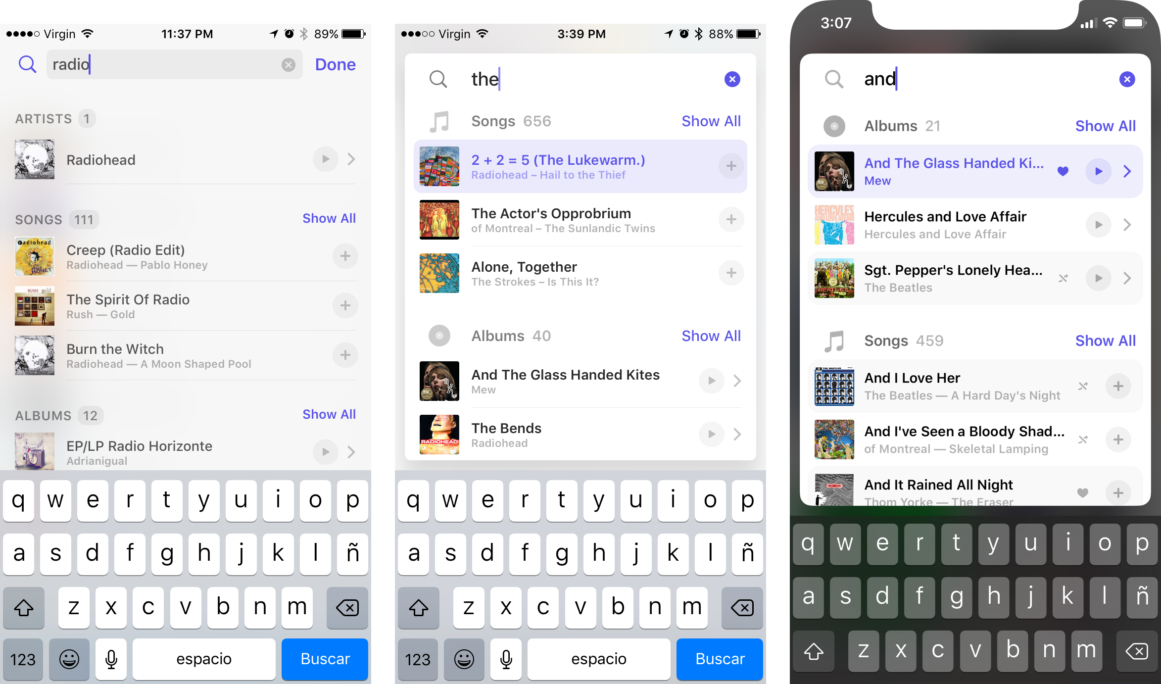 Search through the years.
The original design was fine, for the most part. I wish I could run an old build of the app to capture some video (I had enough trouble submitting screenshots to the App Store back in the day to even think of making an App Preview video), but let me describe it: as you pulled down, the search bar would push down the tab indicator while a gray Search icon started appearing on the overscroll of the table. When the search bar fully replaced the tabs, the icon would turn purple, and releasing triggered Search.
Probably hard to imagine, but trust me, it looked decent. Its main problem was that it was too closely tied with the root library UI, and the gesture seemed so natural that I was always bummed when it didnʼt work elsewhere in the library.
Enter Floating Search. This concept was heavily inspired by Spotlight on the Mac, which can be presented from anywhere on the system by using a keyboard shortcut and appears as a floating window with rounded corners and a big search box. Just like in Spotlight, hitting the return key triggers the top hit, which on Doppi appears highlighted. This enables spur-of-the-moment interactions that hopefully respond as quickly as your brain thinks.
Doppi 3: Visual Realization
Typography
The core impulse behind the visual design of Doppi 3 started on the artist detail screen. Traditionally, this screen gravitated towards the center because standard navigation bars have centered titles. This made having centered secondary titles an easy decision for a view that also featured a paginated scroll of centered album art. This somewhat clashed with the left-aligned song cells, but it wasnʼt very problematic.
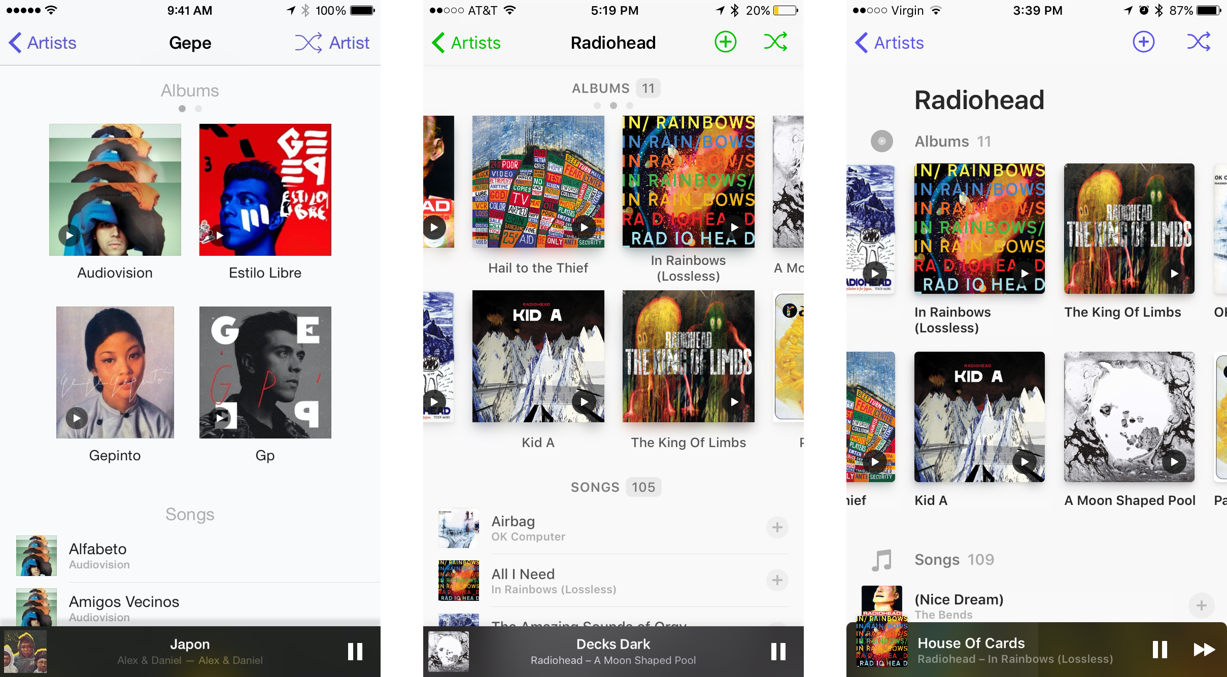 Artist detail on 1.0, 2.2, and 2.3.
The transformation started in Doppi 2.3, with the adoption of a new visual element from iOS 11: large titles. Large titles are left-aligned, and strongly define the leftmost margin for content on a screen. My initial instinct was to just push all content to the very leftmost margin. But that didnʼt quite work.
The main element that broke down was the horizontal grid of albums. While that originally had pagination dots as an affordance for scrollability, I soon moved to having other pages peek around the edges because it seemed easier to understand. But when aligning the entire screen to the leftmost margin, the album grid couldnʼt show peeking artwork on the left side, because there wasnʼt enough room.
This alignment also struck me as unbalanced, because text on the song cells at the bottom started further out to the right. So I decided to align all text and albums to the typographical ruler projected by the text on the song cells. This allowed the artistʼs name to elegantly dominate the landscape, and opened up an incredible amount of white space on the screen.
Traditionally, designing for iOS (and screens in general) meant thinking about ‘boxes’ and their contents. Today, thanks to larger and higher resolution screens, many more principles of print design can be applied, allowing for digital design to be as much about negative space as it is about the elements placed in it. The transition this screen went through is a clear illustration of this.
Ultimately, this typography-forward approach seemed like the way of the future. But implementing this approach across the board on the app was a large engineering undertaking. If Doppi started life with mostly stock iOS components, the UI in Doppi 3 is almost fully built with custom components. This allowed me to have full control over every layout detail to deliver a completely harmonious look and feel.
The War Against Dividers
The one visual element that Doppi inherited from iOS that I felt added noise to the experience was dividers. Hairline dividers use the same hierarchy level as text because they are within the spectrum of weight and color that text uses. And for an app thatʼs inevitably text-heavy, I felt they were distracting. So I set out to eliminate them whenever possible.
A key advantage was enabled by a very early decision that carried over from 1.0: the appʼs default background was a very light shade of gray, meaning that white elements subtly stand out. I borrowed a page from macOS, where zebra-style lists are abundant and make for a pleasing scanning experience on the densest of lists, and made all song and artist lists alternate between the default content background and white.
Other objects, such as lists of playlists or sections on the Preferences screen, seemed to carry enough meaning onto themselves to warrant a different treatment: simple, color-defined containment.
Reachability
As time goes on, phones only seem to get bigger and bigger. The iPhone used to be the thumb-friendly phone, but it seems like it was never meant to keep being that. When Doppi became friendly with the iPhone X, the pain of having all library controls at the top became very real.
So I explored several ways to bring those controls to the bottom. This freed up the top of the screen to adopt large titles across the root library level, but also introduced questions about how to deliver a visual treatment that was clear, unobtrusive, and forward-looking.
Reachability is not just about tapping buttons, though. Following the spirit of Pull to Search, other gestures had to be redefined for ease of access. I completely rebuilt Doppiʼs navigation controller in order to enable swiping from anywhere (not just the edge of the screen) to dismiss a pushed screen, complete with smooth and continuous animations. And I reconfigured Now Playing to enable people to swipe up from anywhere in it to expand Up Next.
The Future
Some key features I envisioned for Doppi remain in planning and design stages. Importing music files without iTunes, for example, is a relatively straightforward (though not simple) technical challenge thatʼs mostly overcome today, but the release of the feature depends on my ability to communicate the three distinct ways a user could transfer music to the app, provide an entrypoint within the UI that serves as both a reminder of the feature and as a way to access a document picker, and explain why some songs can be deleted and some canʼt (meaning, which songs are iTunes-backed and which are file-backed). Update from the future: This was launched in Doppi 4.0. There was also a full, bold redesign of the player UI in Doppi 4.1, check it out.
A similar problem arises with playlist creation. Technically straightforward, but how can I make sure a user understands that Doppi-created playlists wonʼt sync back to iTunes? Setting that expectation correctly while avoiding unnecessary visual cruft is crucial for people to perceive the feature positively.
Another thing Iʼve been slowly exploring for years is bringing Doppi to the iPad and the Mac. Iʼd eventually love for this app to become the one true home for music files across a personʼs devices, with seamless wireless syncing. This remains both a large technical and design undertaking, and Iʼm hardly satisfied with my approaches so far.
Further Reading
Thanks for making it this far. If youʼre interested in reading more about Doppi, check out these old, but still gold, Medium posts:
- Building Doppi: Beginnings and Design (2016, Doppi 2.0). A deeper dive onto the core driving design principles behind the app.
- Building Doppi: Engineering Through Design (2017, Doppi 2.3). A look at my journey engineering this cute little app, warts and all.