←  Radu Dutzan: Portfolio

Command Mobile 4

Revamping Verkada’s flagship app to enable feature parity, while protecting ease of use

top ↑

Background

Verkada is an enterprise building security and management company. The users of their software — IT teams, facilities managers, security operators — manage their Verkada products through Command, a platform primarily developed for desktop. Command can be quite complex.

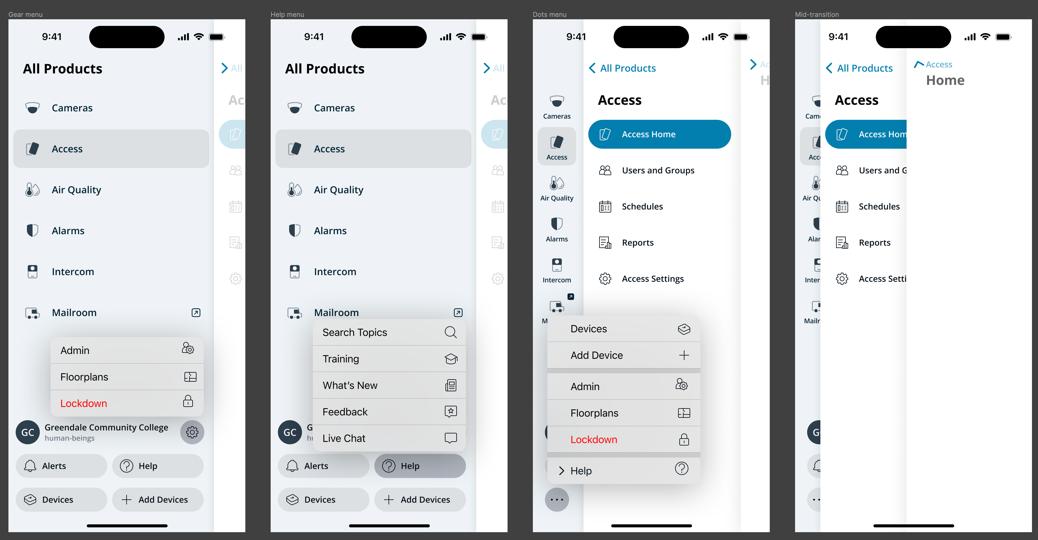
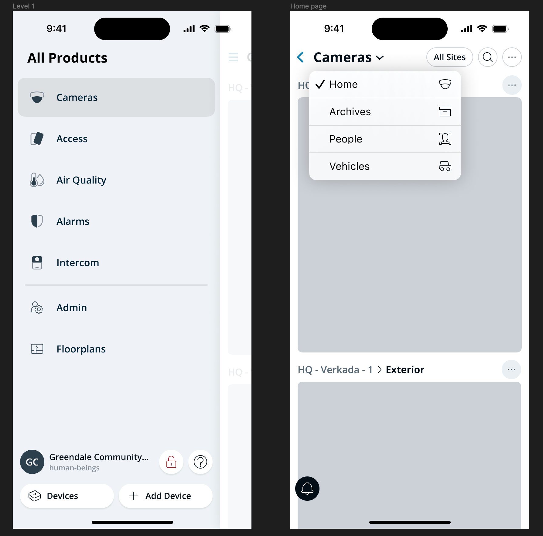
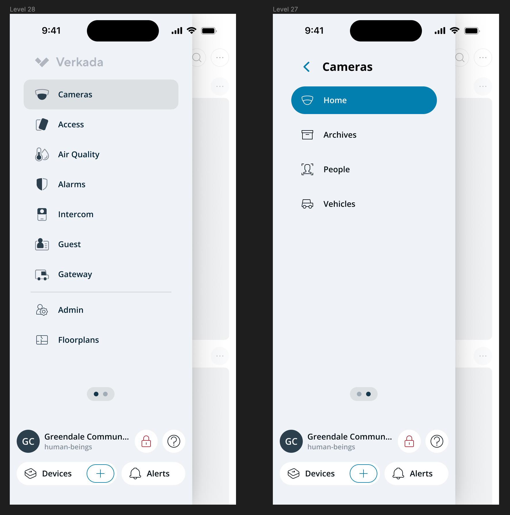
Command Desktop. Each product (Cameras, Access, Air Quality, Alarms, Intercom, Guest, Mailroom, Gateways) lives in its own silo, accessed through a switcher. Many products contain several subpages that are essentially apps in themselves.

The mobile app was a different story. Designed back when the company sold only cameras, it had been frozen in time as the rest of the platform grew around it. Other products had been crammed into it without much clarity, and every tab had its own visual language, depending on when it was added to the app. You’d be forgiven for thinking it was made by a different company.

Unsurprisingly, the most common piece of customer feedback for Verkada Command went something like this:

“I wish I could do [insert task here] from my phone.”

So when I joined the company in April 2023 as the Lead Mobile Designer, I found the team mid-stride on a project to address exactly that.

Project goal

Revamp Command Mobile to enable feature parity, protecting ease of use.

The team had been working on it for seven weeks and was ready to commit to a direction. What they’d landed on, in my opinion, lacked clarity.

The inherited design The design when I joined the project.

Unclear selection states and low contrast compounded into a somewhat confusing UI. To me, the stakes were too high — and the proposed direction too consequential — to just ship it. I asked for some time to rethink. They gave me one week.

Three levels of navigation

The Command navigation interface has to seamlessly manage three levels of hierarchy:

  • Account-level items (sites, settings, alerts, help) — referred to in the project as the utility area.
  • Products (Cameras, Access, Alarms, Intercom, Guest, etc.) — the silos.
  • Product subpages — the deep functionality inside each product, where most actual work happens.

Every iteration that follows is, fundamentally, a different answer to the same question: how do you make all three levels easily accessible on a phone while making it easy for the the user to know where they are at all times?

v0: The Naïve Take

My first response, after a week, was something I thought was structurally smarter: a persistent navigation element, anchored at the bottom, that surfaced the full three-tier hierarchy in a single component. It was thumb-reachable, it kept the utility area visible, and it allowed navigation within product subpages without expanding.

It was designed as a “pro” app for IT people, with efficiency as the dominant value. Every structural benefit of the previous approach was preserved, but in service of being able to access everything as quickly as possible.

v0 — collapsed and expanded states v0: a naïve take.

I reviewed it with John Russell, Verkada’s VP of Design. His verdict was short:

“This is terrible.”

Setting Principles

What followed was more useful than the verdict. He sketched out a quick persona on the spot: a middle-aged man somewhere in the middle of the country who just wants to get his work done and move on with his day. That persona reframed the project for me. It also surfaced something specific to Verkada that I hadn’t fully internalized yet — the company’s whole philosophy is to deliver consumer-grade software in a B2B environment, on the conviction that the people who use enterprise software are the same people who use consumer apps when they get home. They’ve been trained on iMessage and Instagram. There’s no separate “enterprise user” to design down for.

I find that putting the wrong thing in front of the right people can be very useful for the design process. Seeing something completely wrong helps surface all the ideas about what’s right.

The assumption that Command Mobile needed to be a power-user app was the original sin. Yes, our customers are technical. But what these people actually needed from us was clarity, not density.

Back to Basics

I went back to the core navigation patterns of mobile devices for inspiration. The Phone app on iPhone has represented them faithfully since 2007 — millions of people already understand how to use it without thinking twice.

Push navigation, in particular, has two pros and one con that mattered for our use case:

Pros

  • Clear hierarchy with familiar controls. No new mental model to learn.
  • Almost infinitely scalable. Useful for a platform that’s constantly growing.

Con

  • Limited to a single choice per screen. The hierarchy is deep — could I maintain the clarity afforded by this model while providing some degree of efficiency?

I started building from there.

v1: Multi-Layer Navigation

The key idea in v1: take push navigation and chop down the width of the panes so that multiple panes can be on screen at once. Each layer of the hierarchy gets its own pane, partially exposed at the edge of the screen, and the depth of the layers both conveys the hierarchy and provides full access to it. Tap a deeper layer and it slides forward; the parent layer stays visible on the left as a wayfinding anchor.

v1 — three panes on screen at once Items centered for ergonomics?

The full hierarchy unfolded across four levels: products list (Level 1), product subpages (Level 2), home page for the selected subpage, and detail screens.

v1 — four levels of hierarchy 
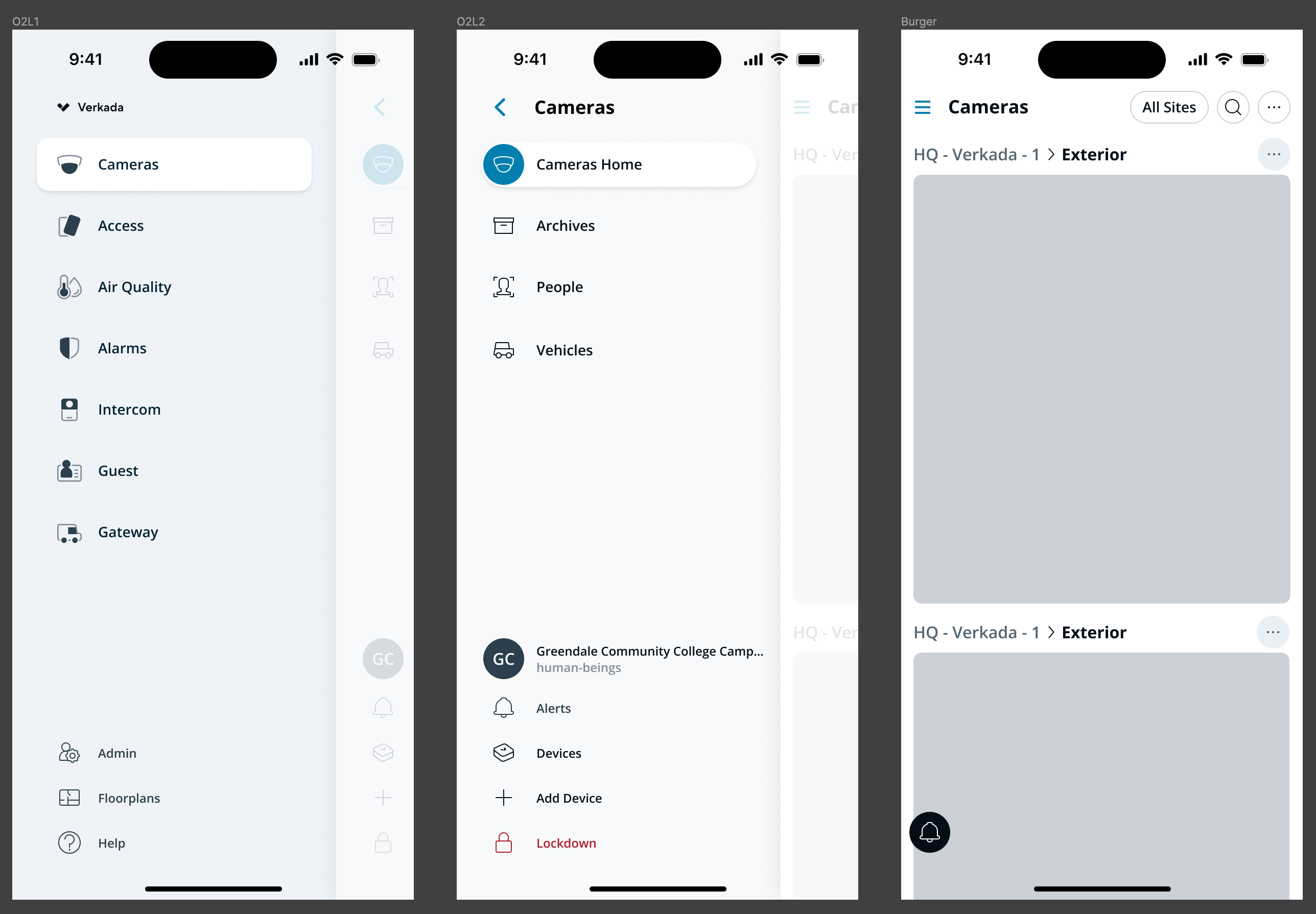
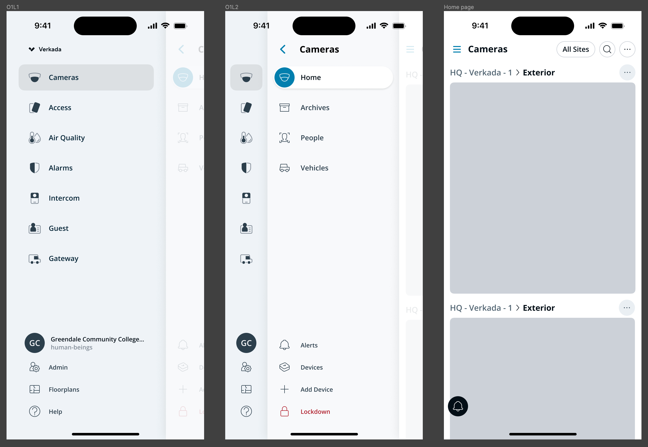
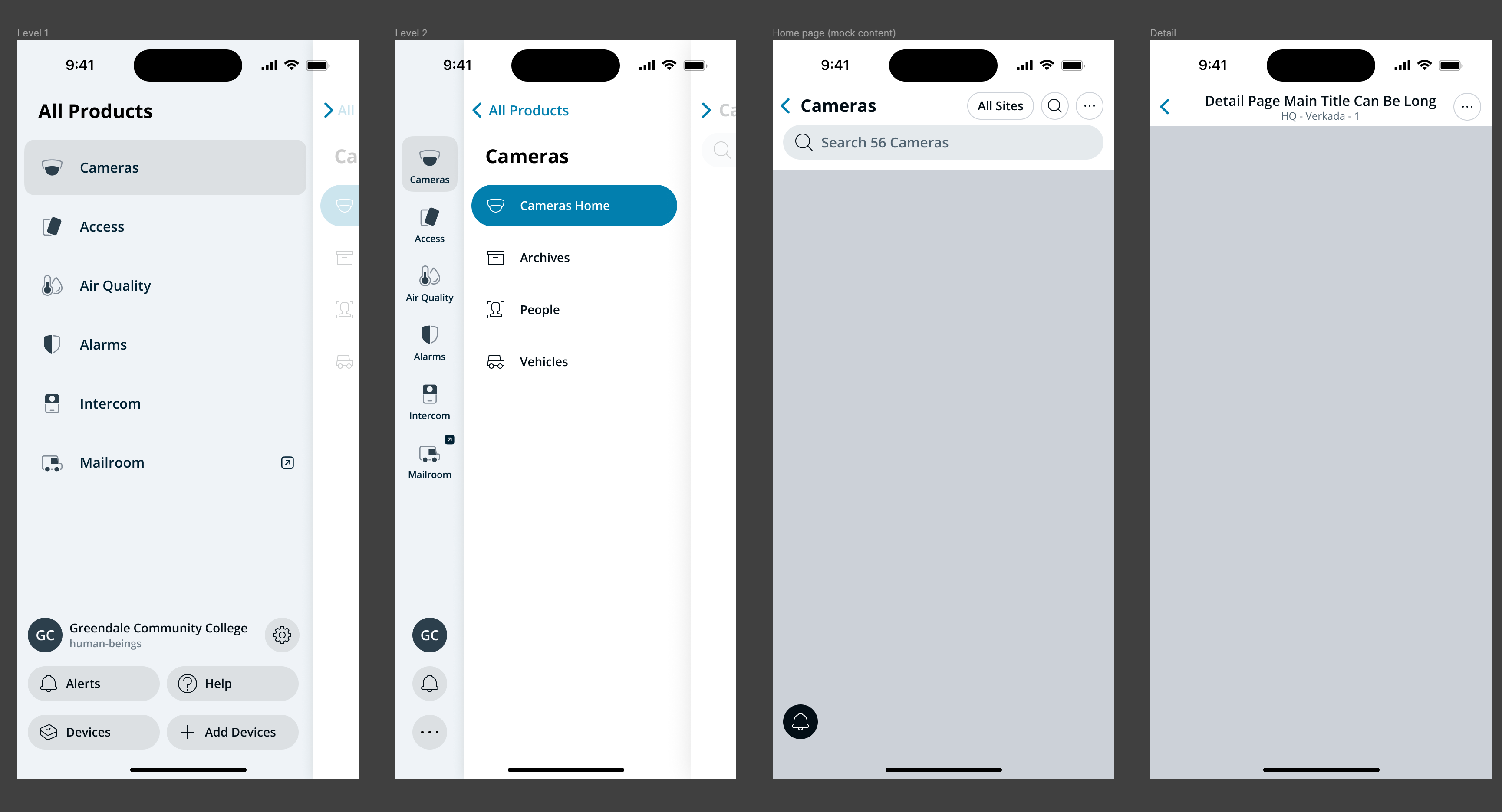
The full stack: Products, Subpages, Home, and Detail

The utility area in this version still lived inside the product layer — anchored at the bottom — and minimized to two buttons and a “more” menu whenever subpages were visible. Functional, but it required collapsing into a menu to make room, which never felt clean.

v1 — utility area menus and transitions You can start to see that this design wants to move, on the 4th screen

I knew feeling the experience on the hand would be key. To evaluate it, I built a prototype in Principle that demonstrated the core interaction.

John’s reaction:

“That’s great!”

…and nothing else, which made me a little suspicious. When has ever a design been just ‘great’, right off the bat? I treated it as a green light to keep going while staying alert.

v2: Refinement

The biggest change in v2 was structural: I consolidated the utility area into its own dedicated layer, sitting above the product subpages rather than sharing the bottom edge with the root product layer. This avoided the awkwardness of v1’s minimized-utility-area state, which was handled with a menu and never quite felt clean. Promoting it to a peer layer in the hierarchy made the interaction model both simpler and more honest about what the utility area actually was.

v2 — three levels with utility area as its own layer

Beyond that, I condensed down the utility area to reduce visual noise and choice overload.

v2 final two levels

This time around, I built a native iOS prototype and distributed it via TestFlight to both the team and the executive sponsors of the project.

That dual distribution turned out to matter as much as the prototype itself: the team could pressure-test the interaction model, and the executives — who were ultimately deciding whether to greenlight a direction at this scale — could experience the interaction in their own hands. It truly helped us not just get buy-in, but build with the highest fidelity available.

With the v2 changes, I thought we had nailed the information architecture. Then, executive feedback came back:

“There’s too much going on.”

True, in a sense — but also an interesting observation about expectations. Mobile apps are not usually intended to be this complex, and displaying all available choices at once is better for clarity and discoverability than hiding them. The team needed reassurance, though, and that meant exploring more options before recommitting.

v3: Exploring Alternatives

I prototyped and distributed a series of alternatives, each one chasing a different read of what “too much” meant.

v3 — condensed root alternative 
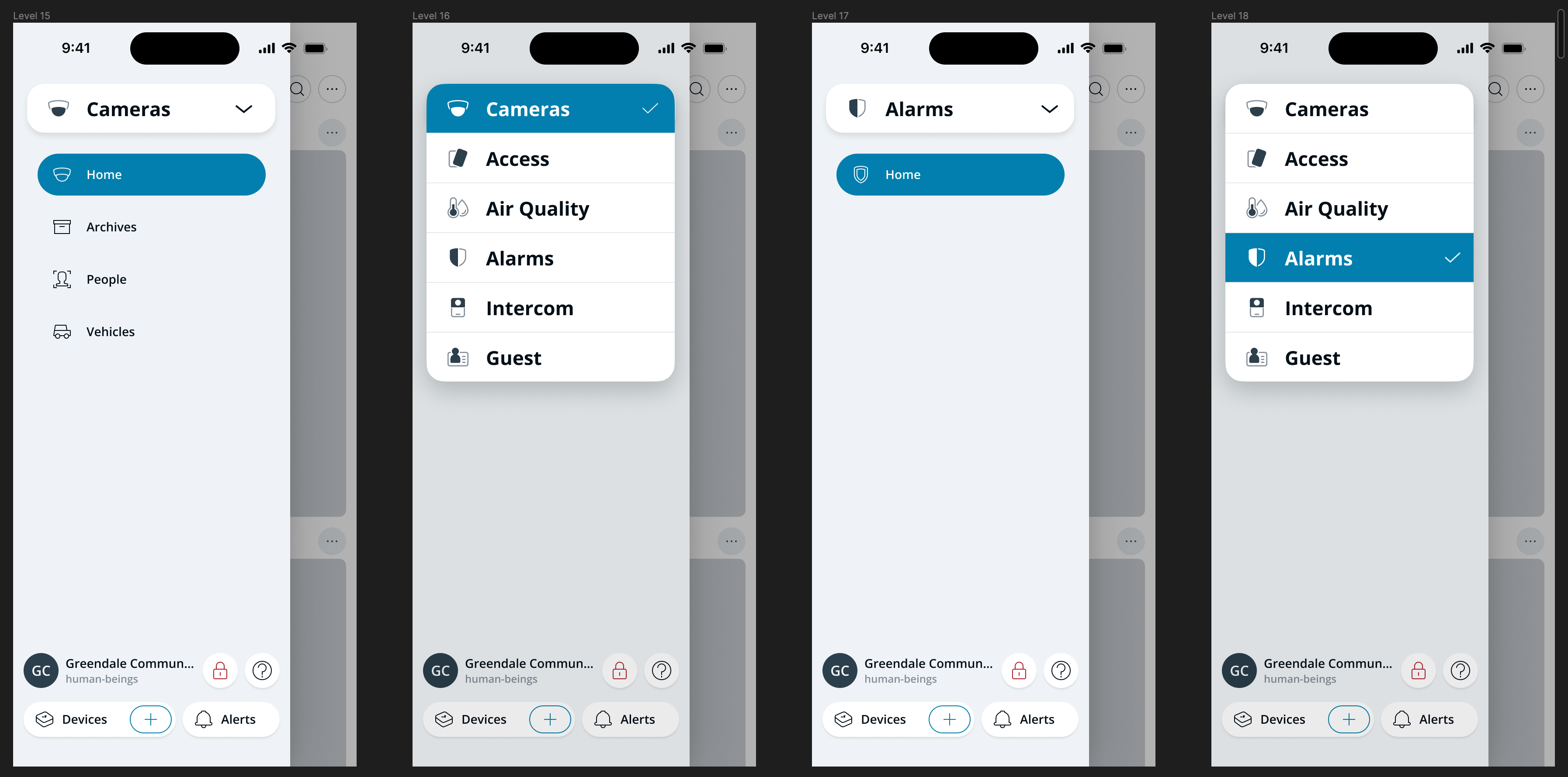
Condensed root. Root-level navigation collapsed into a dropdown. This came as a direct recommendation from the CTO.
v3 — condensed middle alternative 
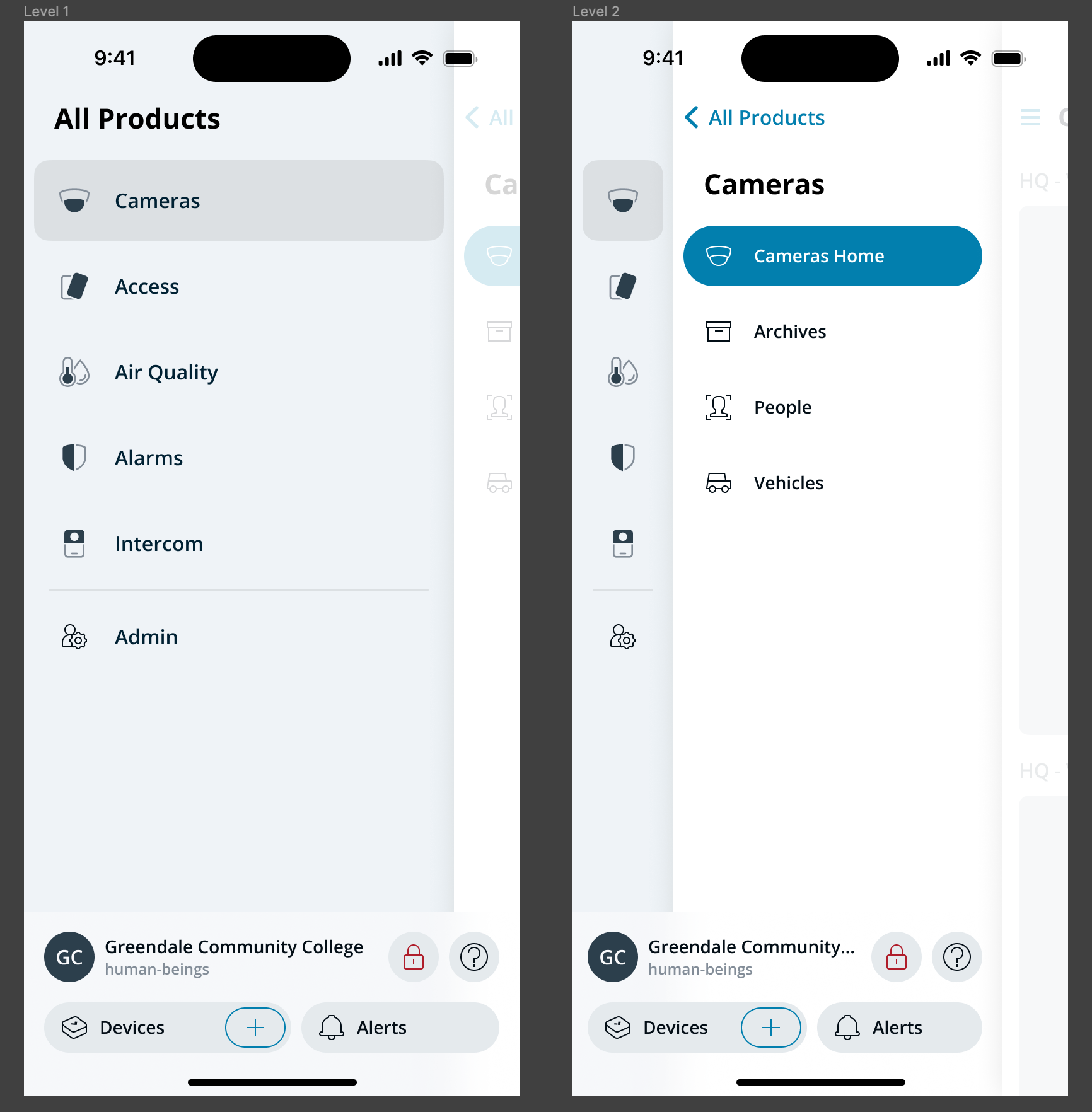
Condensed middle. The middle level merged into the home screen.

Collapsing the choices into a dropdown didn’t just add friction. This product was intended to launch with a minimal initial product offering, planned to expand over the coming months as teams adopted the design and engineering frameworks. Hiding the new options would have put us in a position of having to ask the user to open a menu just to be informed about what’s new.

v3 — stacked levels alternative 
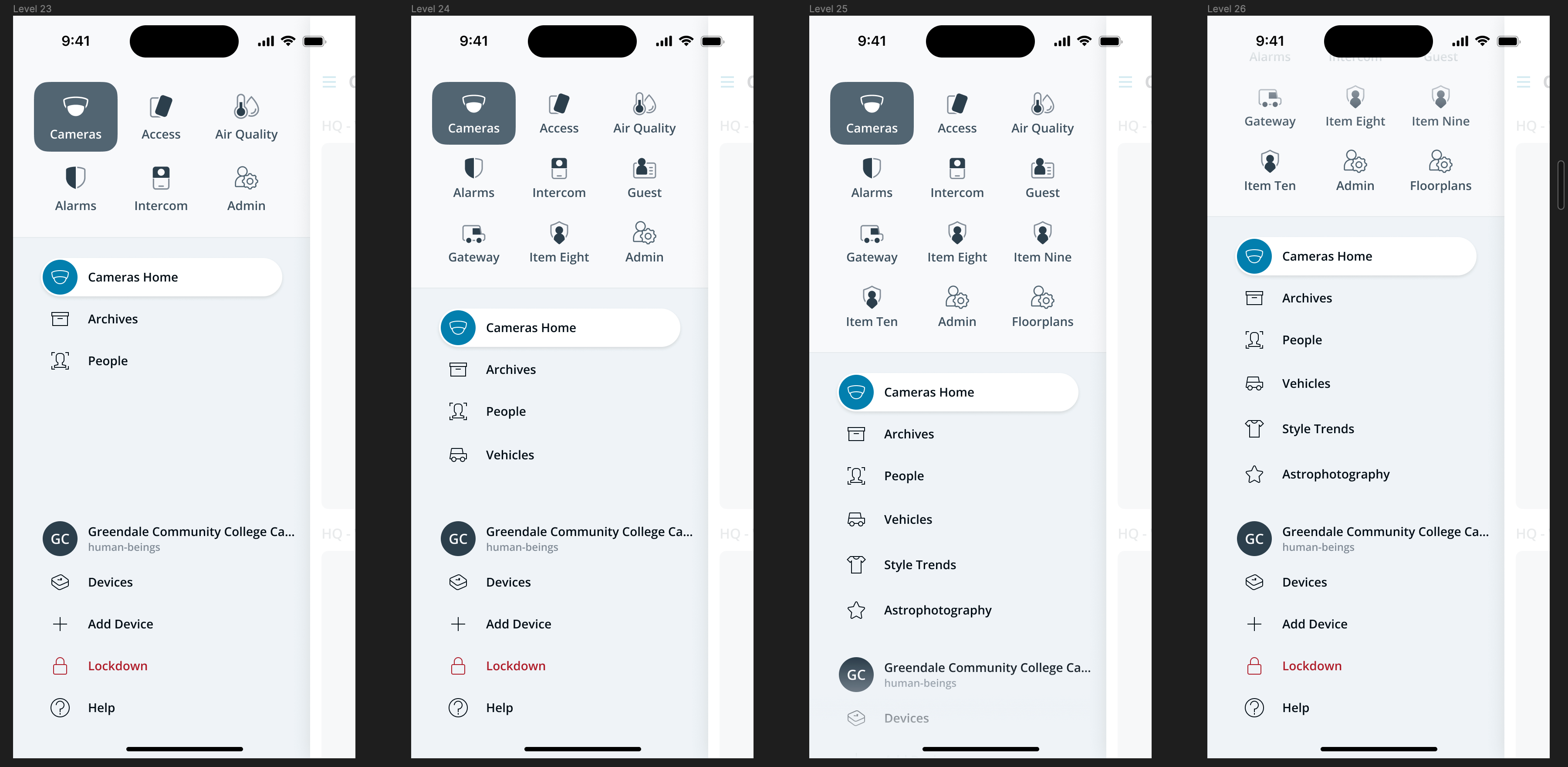
Stacked levels. Both levels of hierarchy presented at once.
v3 — swipe between levels alternative Swipe between levels. Hierarchically wrong, but there was appetite to bring back swiping.
v3 — one layer at a time alternative 
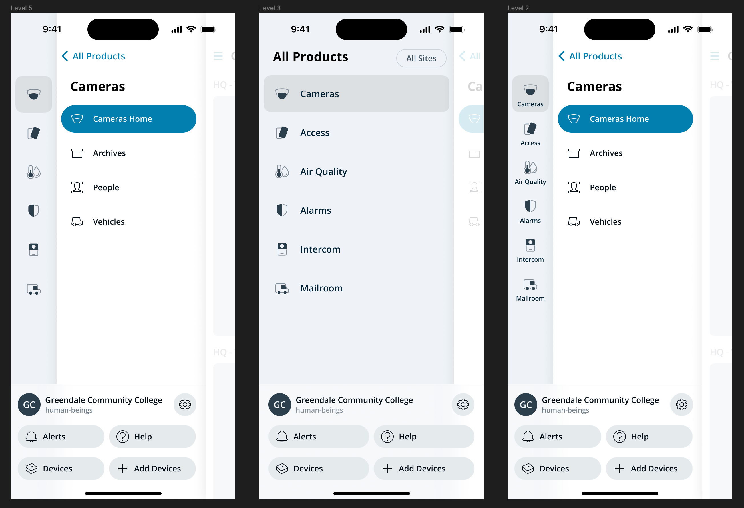
One layer at a time. Bringing back layers, but only ever showing one to reduce cognitive load.

In parallel, I kept developing a refined version of the v2 blended-layer approach, with a split utility area.

v3 — refined blended-layer approach

After a round of prototype testing across all of these, the team came back to that one. Structurally, it was v2. What changed was the visual layer — clearer contrast, sharper hierarchy, more breathing room — and that polish was what let people read the structure without feeling crowded by it.

There’s a real lesson buried in this loop, and it took the detour to surface it: the executive feedback wasn’t wrong, it was just diagnosing the symptom rather than the cause. “Too much going on” pointed at the visual treatment, not the IA. The only way to know that for sure was to put alternatives in people’s hands and let them feel the difference. The structure earned its place by surviving the alternatives, not by being defended against them.

Prototype-Driven Design and Development

A throughline of this project was the role of prototypes in advancing decisions. v1 was demonstrated through an interaction prototype built in Principle. v2 and the final design were built as native iOS prototypes in Swift, distributed via TestFlight. The progression — from interaction demo to running app — wasn’t incidental. Three things came out of that approach:

  • The feel of the design could be communicated accurately. Mobile interaction quality lives in details that flat Figma mockups or screen-recorded animations can’t fully convey: the friction of a gesture, how a layer responds to a half-tap, the cadence of a transition under your thumb. Putting a real build on a real phone is the only way to communicate any of that with fidelity, and it’s what allows the conversation to be about the design rather than about the medium it’s being presented in.
  • Testing produced real insights. Builds distributed to the team and to executives caught problems that mockups would have hidden, and surfaced reactions that wouldn’t have come up in a review meeting.
  • The prototype code became a production resource. When engineers picked up the work, they were able to lift patterns and components from my prototypes directly into the production app. That accelerated development, but more importantly, it ensured 1:1 fidelity with the design and interactions I’d been polishing in code — no translation step where intent gets lost between design and engineering.

iPhone, Android & Web: Harmony

The final navigation system — full iOS spec

We didn’t just design for iPhone. The team was passionate about delivering equivalent quality on Android, and the navigation model was developed from the start with both platforms in mind.

The same navigation system, on Android

But Verkada’s true native platform is the web. In order to integrate the web-based products with our native controls, and to elevate the consistency of the user experience of the mobile web app, I reviewed all the existing mobile web products to find emerging patterns.

Mobile web audit 
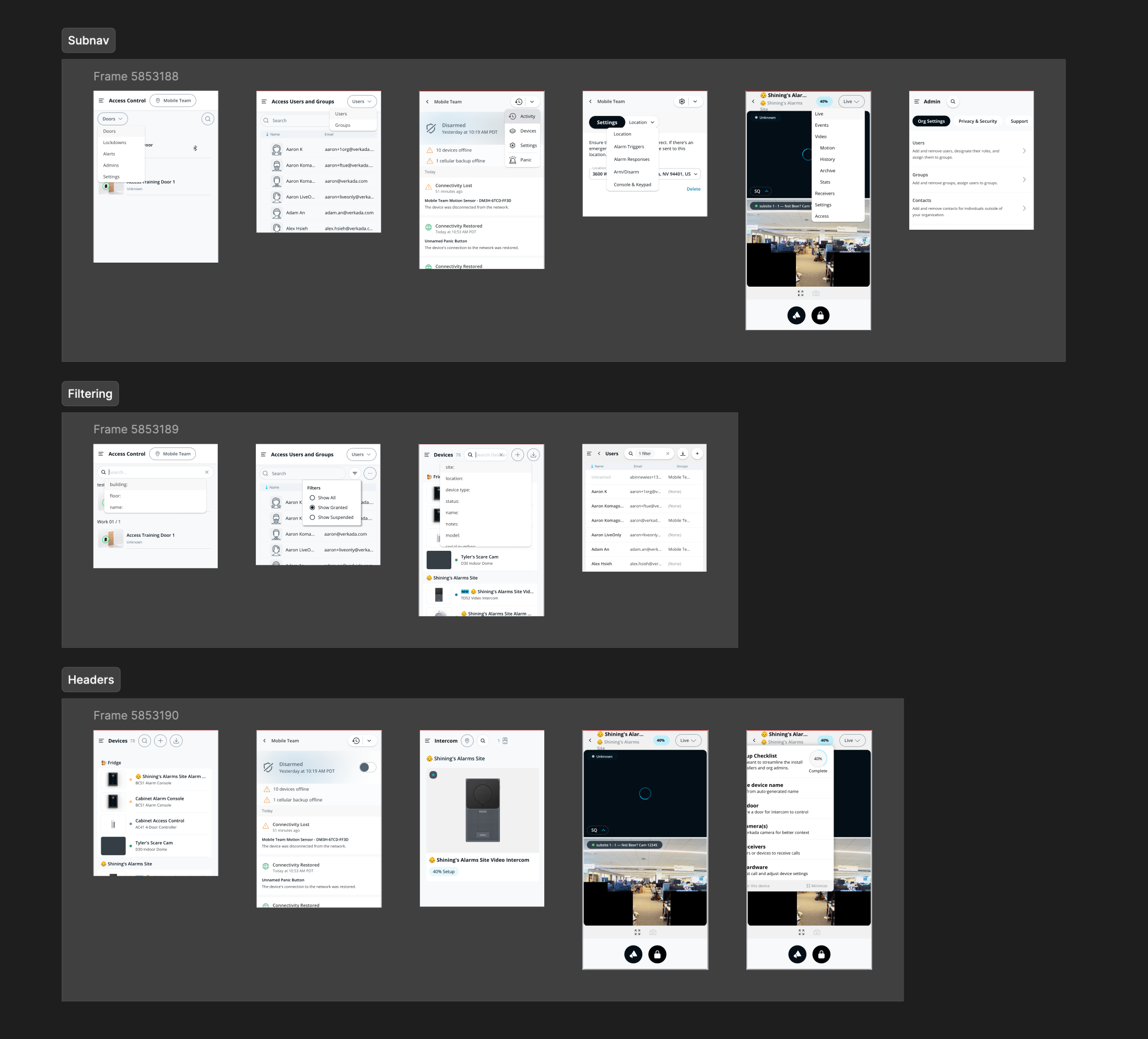
The products had varying degrees of adaptation to mobile, with varying degrees of success.

Cross-Platform Mobile Navigation Framework

The result was a framework that covered both native products and mobile web products, requiring very few modifications from the client products, if any. This enabled the app grow to the scale of Command Desktop without each new product reinventing its own navigation.

Home Page Navigation Bar — iOS, Android, and Web variants
Detail Page Navigation Bar framework

Within months, three mobile web products — Alarms, Gateway, and Admin — were fully integrated into the new framework. Gateway became the fastest new product to appear on Command Mobile in the company’s history.

Gateway, Alarms, and Admin integrated into the new framework 
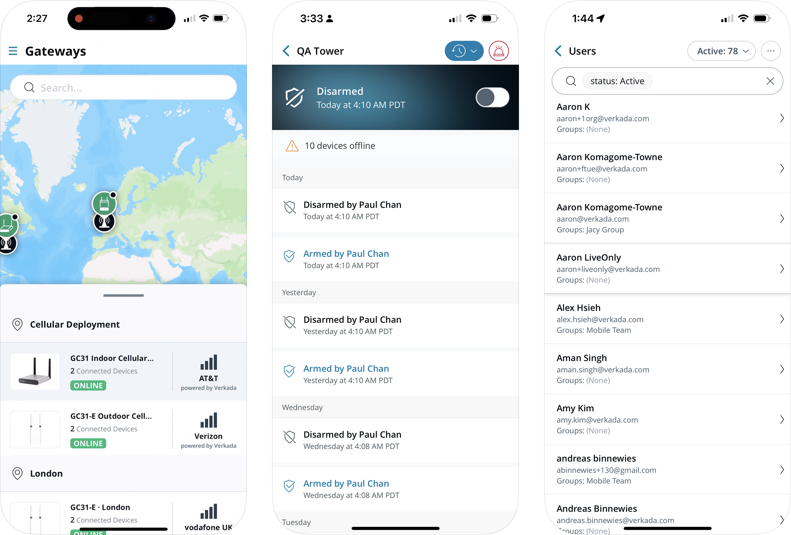
The first mobile web product integrations.

Outcome

After a few months of limited-reach testing, Command Mobile 4 launched to all users in March 2024.

2.5× increase in MAU across mobile platforms

Within three months of launch (March–June 2024)

Success Factors

Looking back, a few things made this project work:

  • A clear usability target. “Clarity over efficiency” gave us a sharp point of comparison for every decision.
  • Leadership through prototyping. Distributing real builds — to teams, to engineers, to executives — moved the project forward at every decision point.
  • High polish for a great brand experience. The visual refinement work between v2 and the final design wasn’t decoration; it was what made the structure legible.
  • Deep collaboration with engineering. Prototype code feeding directly into production tightened the loop between design intent and shipped reality.
  • High aspirations inspired team contributions. When the bar is visibly high, people show up to meet it.